
MOGUL
MOGUL
Mogul is an online training platform, that needed an identity which enabled the brand to take on the travel training sector and thrive by standing out of the crowd.
CAPABILITIES
Identity
Branding
Web Design

The logo is inspired by the company's historical links to skiing and the Black Diamond ski slope.
I discovered that blending the letter M with a triangle was a fitting nod to the company's history. Through the application of bright colours, it is a visual metaphor for the modern, on-trend company ready to stand out.


In a world where we are constantly bombarded by different messages, a brand needs to be able to stand out.
Bright, contrasting colours in the palette enabled me to design colourful, standout business cards as well as additional stationery. Using the bold colour palette and strong typography, I designed the Mogul website to have a sleek, modern look. The aim was to create a website for the brand that would enable the user's experience to be more visually enjoyable whilst maintaining its functional and educational purpose.

COLOUR

COLOUR

COLOUR

COLOUR

COLOUR


Stationary
Selected Works

Unwrap the MagicCampaign Identity
UFC x PokerStarsMarketing & Identity
KrusoviceMarketing & Web Design
Ooh La LaIdentity & Packaging
Cotton CrimesPoster Design & Photography

Teddy the BearStory Book
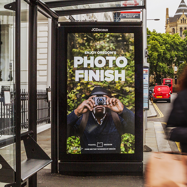
Travel OregonAdvertising
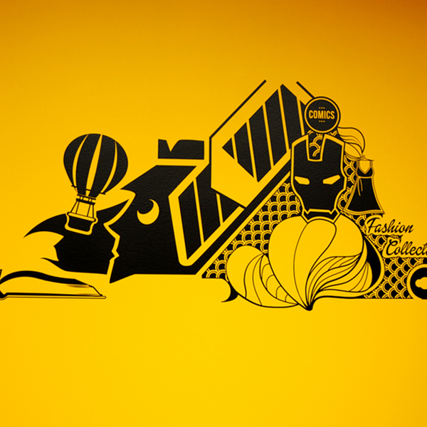
Wall MuralIllustration & Vinyl Cutting
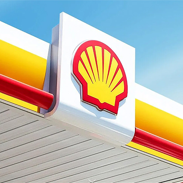
Shell V-PowerMarketing
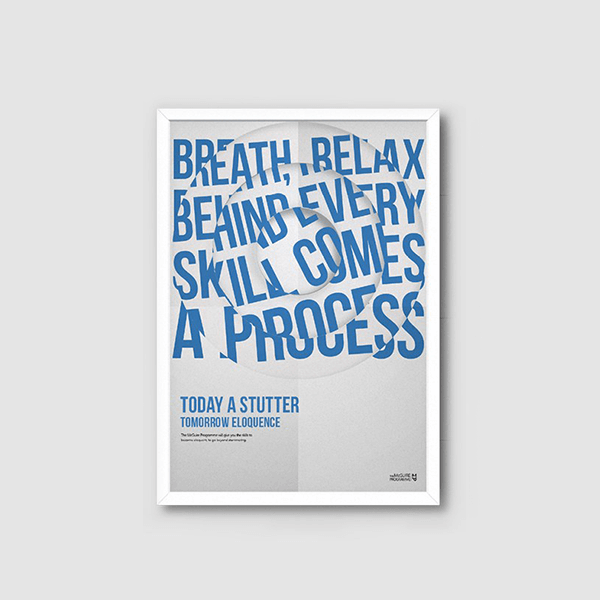
Mcguire ProgrammePoster Design
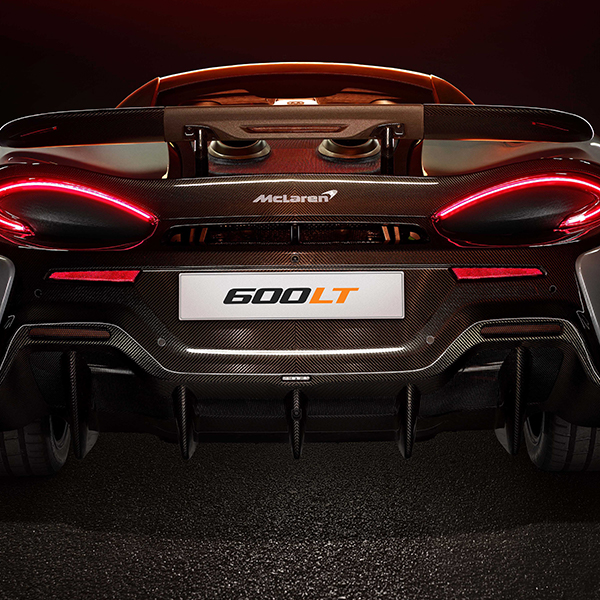
McLarenAdvertising
Mogul - Training HubHub Design
SA Travel BlogBlog Design
Mogul - IdentityIdentity
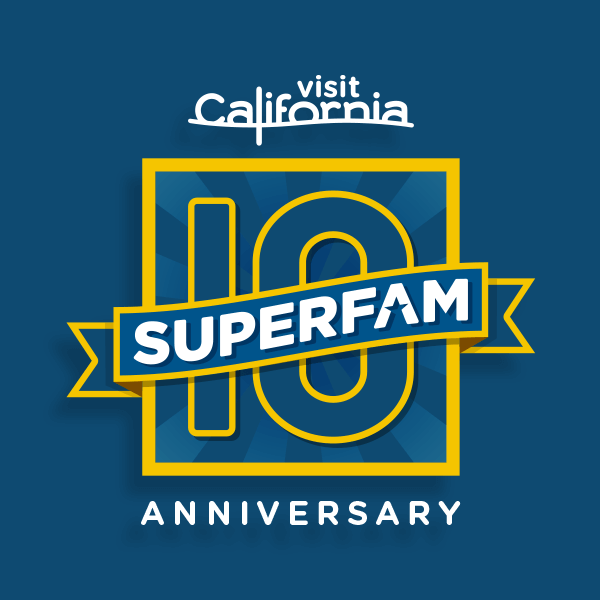
Visit CaliforniaMarketing
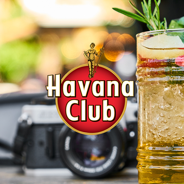
Havana ClubLogo & Graphic Design

Visit PeruTraining Site
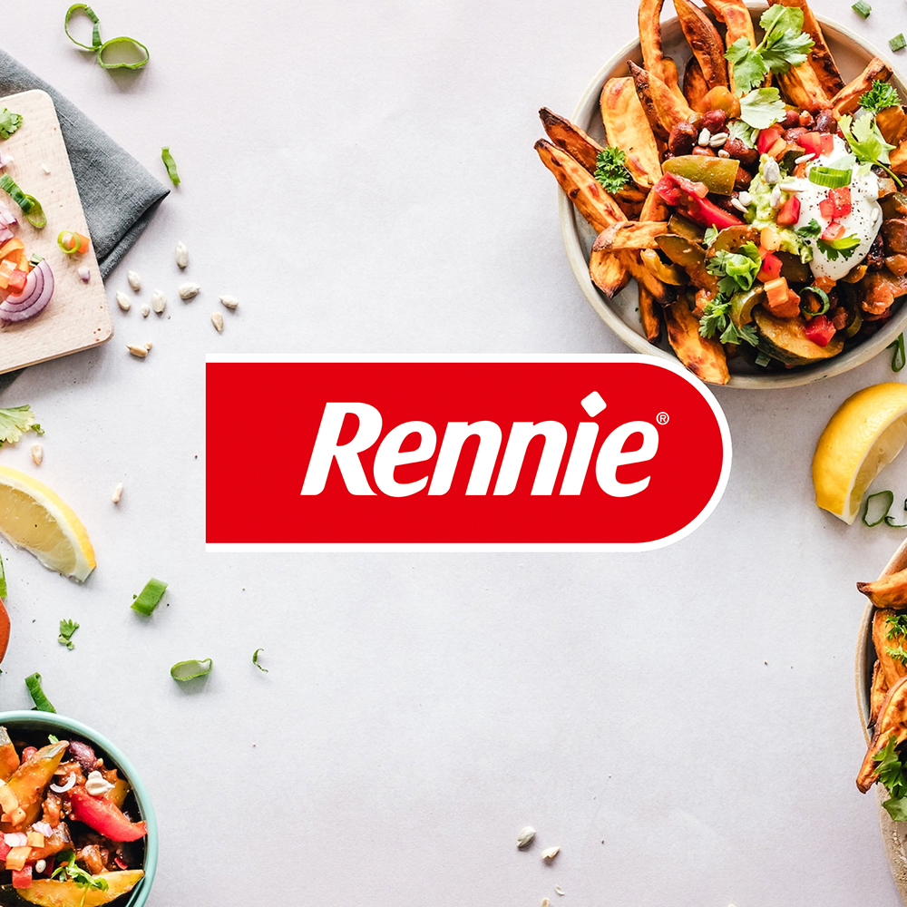
Rennie PackagingPackaging
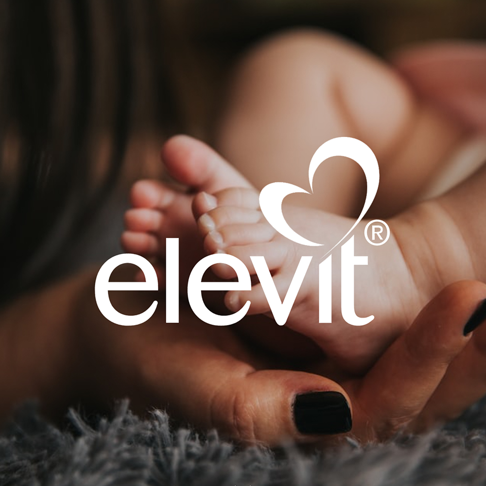
ElevitPackaging